
Color Palettes That Elevate Home Design
Color Palettes That Elevate Home Design, color is more than a decorative choice. It is a language that shapes mood, space, and emotional connection to your home. Selecting color palettes for home design transforms a residence into a personalized haven, infusing each room with intention, warmth, and timeless beauty.
Explore the world of color with the confidence to craft spaces that breathe, dance with light, and radiate character. Dive into how the right shades can expand a room, cozy a corner, or energize a kitchen, embracing color as your most powerful design ally.
1. Understanding Color Psychology
Every hue whispers its own story. Colors can calm the nervous system, invigorate the mind, or cradle you in serenity after a long day.
- Blues convey tranquility and trust, ideal for bedrooms and bathrooms.
- Greens evoke renewal and connection to nature, perfect for living areas and studies.
- Yellows offer warmth and optimism, brightening kitchens and sunrooms.
- Neutrals provide grounding, balancing brighter tones without overwhelming the senses.
Using color palettes for home design allows you to set the emotional rhythm of your home while maintaining cohesion throughout.
2. The Power of Undertones
Colors are more layered than they appear. A white can be warm with yellow undertones or cool with blue undertones, shifting how a room feels in natural or artificial light.
When crafting color palettes for home design, test swatches at different times of the day to see how light transforms your chosen hues. A warm gray may appear cozy in the morning light but lean taupe under warm bulbs at night, affecting the room’s emotional pull.
3. Neutral Foundations That Never Fail
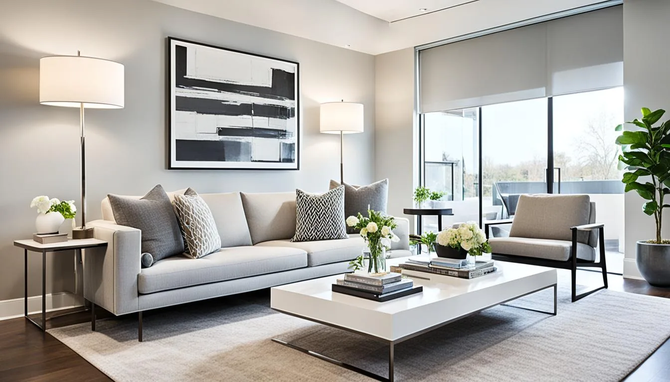
A timeless approach to color palettes for home design begins with a neutral base. Soft whites, warm beiges, muted grays, and gentle taupes create a serene canvas that accommodates layered colors and textures.
Neutral walls expand small spaces while providing flexibility for seasonal changes. Accent with deeper hues in art, rugs, or furniture to introduce warmth or depth without crowding the room visually.
4. Nature-Inspired Palettes
Mother Nature is the ultimate colorist. Drawing inspiration from earthy greens, deep blues, terracotta, and sandy tones fosters a grounding environment that resonates with calm and connection.
Pairing moss greens with cream or wood tones in living rooms brings the outdoors in, while coastal blues paired with crisp whites create breezy, light-filled spaces.
Color palettes for home design that mirror nature evoke harmony, helping you unwind and reconnect with the organic rhythms of life.
5. Creating Flow With Color
Each room should have its personality, yet a sense of harmony throughout your home creates an elegant, flowing narrative.
Using a consistent undertone or a unifying color thread across different rooms can connect spaces seamlessly. For example, if sage green is your choice for the living area, a lighter whisper of that green in the hallway or bathroom can maintain flow while allowing each room to express its unique identity.
6. Statement Walls Done Right
An accent wall can add depth and character without overwhelming your design. Deep charcoal in a dining room or a navy wall in a study can add dimension while keeping the overall feel balanced.
When using color palettes for home design, ensure accent walls harmonize with adjoining spaces. Choose colors that complement the primary palette, maintaining visual cohesion while adding interest.
7. Playing With Contrast
Contrast adds life to interiors. The interplay of light and dark, warm and cool, or matte and gloss finishes creates depth and keeps your design engaging.
For example:
- A charcoal sofa against a pale gray wall.
- Soft blush pillows on a deep green armchair.
- A glossy backsplash in a matte-finished kitchen.
Using color palettes for home design strategically allows you to play with contrast while ensuring the overall aesthetic feels intentional and elevated.
8. Seasonal Shifts Without Full Redecoration
Seasons bring natural changes in light and mood, which you can reflect in your home without repainting.
- Spring: Add pastel throws and floral arrangements.
- Summer: Incorporate light linens and oceanic blues.
- Fall: Layer in burnt oranges, deep greens, and rustic browns.
- Winter: Embrace deep burgundy, forest green, and warm textures.
Your neutral base allows you to adjust accent colors, giving your space a fresh feel as the seasons shift while keeping your color palettes for home design consistent.
9. Harmonizing Open Spaces
In open-plan living areas, consistent color palettes for home design are essential for harmony. Opt for a core neutral with variations in tone to define different zones subtly.
For example, use a warm greige in the living space while moving to a slightly lighter tone in the dining area. You can introduce color through decor, artwork, and accent furniture to add individuality while maintaining flow.
10. The Magic of Soft Pastels
Pastels are no longer reserved for nurseries. Soft pinks, muted lavenders, and gentle aquas add freshness without overpowering a space.
Pastel blue cabinets in a kitchen, blush accessories in a living room, or mint accents in a bathroom can inject personality while maintaining a serene environment.
Leveraging pastels in color palettes for home design is perfect for adding a delicate touch of color while keeping your space feeling open and airy.
11. Dark and Moody Spaces
Dark colors can make a room feel cocoon-like and sophisticated when used intentionally.
Deep navy, charcoal, or forest green walls paired with warm woods and metallic accents create a luxurious yet comforting environment, perfect for reading rooms, dining rooms, or cozy bedrooms.
Color palettes for home design using dark hues should consider lighting carefully, balancing natural and artificial sources to prevent the space from feeling oppressive.
12. Color in Small Spaces
Contrary to popular belief, small spaces can handle color. A powder room in deep teal or a cozy reading nook in plum can feel intimate rather than cramped.
When working with small spaces:
- Use lighter ceilings to expand the height visually.
- Balance rich walls with lighter accents and reflective surfaces.
- Choose a cohesive color palette to avoid visual clutter.
These techniques allow you to confidently apply color palettes for home design in compact areas, creating jewel-box moments in your home.
13. Textures as Part of Your Palette
Color is not only about paint; it also lives in textures and materials.
- A leather sofa adds warmth.
- Linen curtains bring softness.
- Brass fixtures add a warm glow.
- Concrete countertops contribute cool undertones.
Integrating texture within your color palettes for home design creates depth and sensory richness, ensuring your space feels dynamic while remaining cohesive.
14. Using Color to Highlight Architecture
Color can accentuate architectural details:
- Painting window trims in a contrasting color.
- Highlighting built-in shelving with a deeper shade.
- Using color to define ceiling beams or alcoves.
These subtle uses of color palettes for home design draw attention to the craftsmanship in your home while adding depth and visual intrigue.
15. Choosing the Right White
White is not just white. It comes in hundreds of shades with varying undertones:
- Warm whites with yellow or pink undertones for cozy environments.
- Cool whites with blue or gray undertones for modern, crisp aesthetics.
Test your chosen whites in your space, observing how natural light influences the undertone. The perfect white will enhance your color palettes for home design, creating a clean yet welcoming backdrop.
16. The Role of Lighting in Color Perception
Light transforms color. Natural daylight shows the truest hue, incandescent light adds warmth, and fluorescent lighting often casts a cool tone.
Before finalizing your color palettes for home design, evaluate colors under all lighting conditions in your space to ensure your chosen palette maintains its beauty throughout the day.
17. Incorporating Personal Color Preferences
Your home should reflect your tastes and the colors that bring you joy. Love bold reds or deep purples? Use them in accent pieces, artwork, or a feature wall balanced with neutral surroundings.
The best color palettes for home design balance your personality with timeless design principles, creating a space that feels authentically yours.
18. Sustainable and Healthy Paint Choices
When selecting paint for your color palette, opt for low-VOC or natural paints to ensure a healthy indoor environment.
Sustainable choices protect both your family’s health and the environment while ensuring your chosen color palettes for home design last beautifully over time.
19. Building a Mood Board
Creating a mood board helps you visualize how colors interact before committing to them.
- Collect fabric swatches, paint chips, images of furniture, and decor pieces.
- Observe the interplay of colors and textures.
- Adjust until your board reflects the emotion and aesthetic you envision for your home.
Mood boards are invaluable when curating color palettes for home design, giving you clarity and confidence in your choices.
20. Trending Palettes vs. Timeless Choices
While staying aware of color trends can be inspiring, timeless palettes often offer longevity.
- Trend: Rich browns and earthy tones are currently popular.
- Timeless: Neutrals paired with a preferred accent color never date.
Your color palettes for home design should prioritize your lifestyle, ensuring your space feels relevant and comforting for years to come.
21. Inviting Professional Help
If overwhelmed, consider consulting a color expert or interior designer. They can analyze your lighting, preferences, and architectural features to recommend color palettes for home design that align with your vision.
Their expertise can help you avoid costly mistakes, ensuring each color contributes positively to your home’s overall aesthetic.
Color as a Tool for Transformation
Color holds the transformative power to elevate your home, reflecting your personality while shaping your space’s function and emotion. Through thoughtful curation of color palettes for home design, you can:
- Expand spaces visually.
- Create cozy retreats.
- Set moods that align with each room’s purpose.
- Showcase architectural features with confidence.
- Maintain flexibility for seasonal refreshes.
Start by observing the colors that bring you calm, energy, or inspiration. Test shades under various lighting. Layer colors with textures, patterns, and finishes, ensuring your palette feels rich yet cohesive.
A home designed with intentional color is more than visually pleasing. It is a place that supports your lifestyle, energizes your mornings, soothes your evenings, and welcomes every guest with warmth and personality.
Color is your quiet guide in creating a home you love. Embrace its language, and watch your spaces transform into reflections of your best self, one thoughtfully chosen hue at a time.


